EN
EN
 CZ
CZ
 DE
DE
 PL
PL
 ES
ES
 FR
FR
 IT
IT
 HU
HU
 SK
SK
 UA
UA
 EL
EL
Data for decision-making: dock utilization in Power BI from the TSC OData API

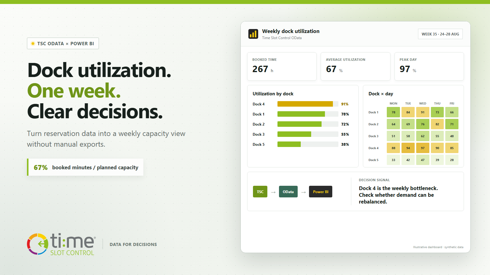
A reservation calendar helps manage today’s operations. Capacity decisions require a different view: which dock is overloaded during the week, where capacity remains available, and whether the workload is merely shifting from one day to another.
Time Slot Control already contains the data needed for this view. Its OData API makes the data available to Power BI without manual exports or copying values into another spreadsheet. A first report needs only two datasets: reservations and resources, meaning docks or other workplaces.
Connect in three steps
- Create a dedicated Time Slot Control account with a role that permits API access.
- In Power BI, select Get data → OData Feed and enter the service root URL:
https://api.timeslotcontrol.com/odata/v1/[tenant] - Select Basic authentication, then choose the
ReservationandResourceentities in the Navigator.
Power BI requests the credentials separately. The password therefore does not belong in Power Query, an image, or a shared report-definition file. After loading the data, relate the tables through Reservation.ResourceId = Resource.Id. TSC OData does not support $expand, so this relationship is clearer in the data model than one wide, composite query.
What weekly utilization actually requires
For a basic view, the reservation data only needs the dock identifier, planned start and end, approval status, and a few fields for checking exceptions. The resource directory supplies the dock name and site. The OData query can be limited to the selected week and required columns, so Power BI does not retrieve the entire history and full data contract with every refresh.
The number of reservations alone is not utilization. Ten short slots can occupy less time than four long operations. The sample report therefore uses this definition:
Dock utilization = booked minutes / planned available minutes.
For the example, the operating window is set uniformly to 16 hours per working day. In a real deployment, the denominator should reflect shifts, opening hours, and any parallel capacity of each dock. You also need to decide whether to include pending reservations, rejected requests, or no-shows. The report should display this definition clearly so that the same percentage represents the same operating rule for everyone.
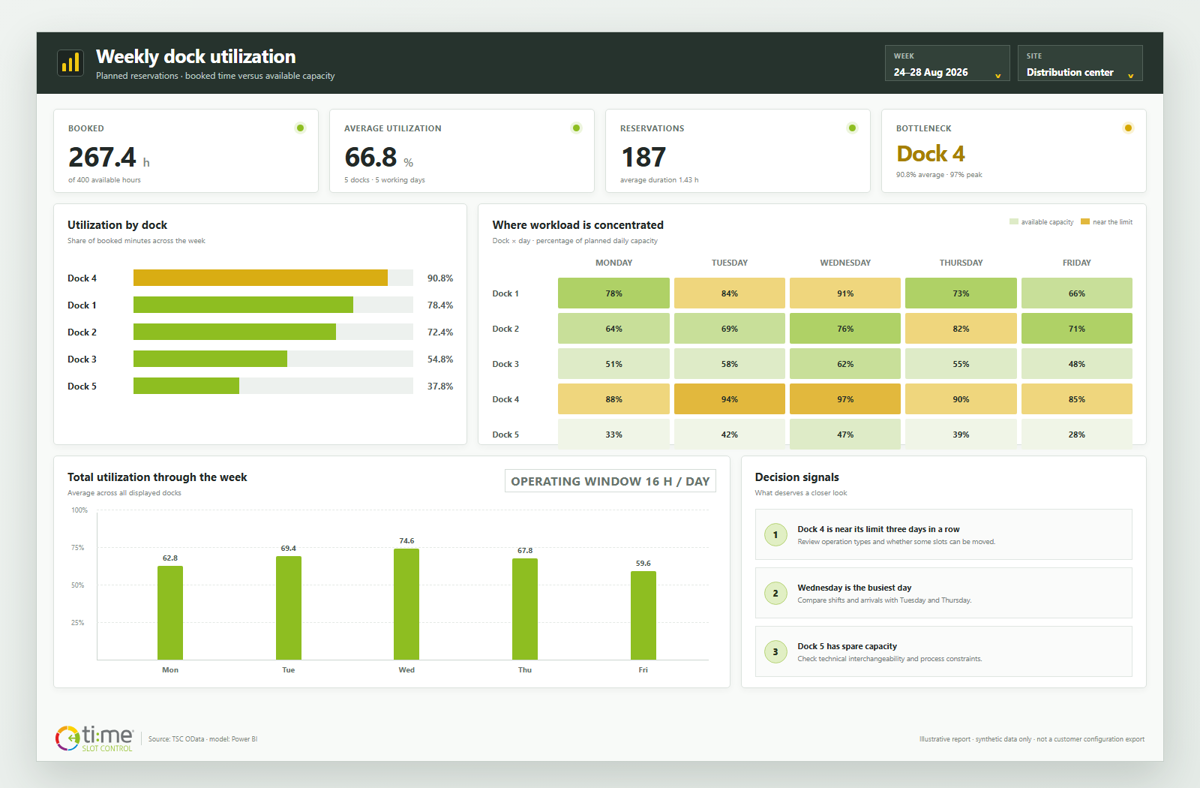
The visual uses synthetic data and does not represent any specific customer report or configuration.
One page answers four practical questions
- How are we doing overall? KPI cards show booked hours, average utilization, and the highest daily peak.
- Where is the bottleneck? A dock ranking quickly reveals workplaces that repeatedly approach full capacity.
- Which day is problematic? A heat map compares docks and days in one view and highlights uneven distribution.
- What is behind a specific number? Reservation details let users move from a percentage to individual slots, their duration, and status.
In the sample data, Dock 4 has the highest utilization. That result alone does not prove that adding capacity is the right response. The cause could be poorly distributed arrival times, long reserved blocks, a different operation type, or capacity that could be shifted to another dock. The report makes the question visible; the decision comes from combining the number with knowledge of the process.
From planned capacity to further decision views
The same data model can be expanded gradually. Planned times can be compared with the vehicle’s actual arrival and departure, no-show rates can be monitored, inbound and outbound operations can be compared, or weight, volume, and the number of handling units can be added. Alongside utilization, this can provide a view of planning reliability and the demands of individual operations.
Useful next steps include:
- planned versus actual service time,
- utilization by site, reservation type, or carrier,
- trends in no-shows and arrivals outside the planned window,
- a capacity outlook for the coming weeks,
- comparison of booked time with volume, weight, or pallet count.
Refresh without another export
The sample uses Power BI’s Import mode. Users can refresh the data on demand and configure scheduled refreshes in the Power BI Service after publishing the report. The result therefore reflects the latest successful refresh; it is not a live operational monitor. For managing loading and unloading that is currently under way, the TSC calendar and Slot Monitor remain the right tools. Power BI adds an analytical view for comparison, trends, and decision-making.
When publishing the report, credentials for the data source—and, depending on the architecture, a data gateway—must be configured securely. We recommend a dedicated API account with the minimum required permissions, a query limited to the necessary period, and clearly documented metric rules.
Start with one question, not dozens of charts
The first version does not need to be extensive. Weekly dock utilization is a strong pilot: it uses understandable data, the result can be compared with operational experience, and the report can be refined quickly. Once the capacity definition and filters have been confirmed, the same connection method can support other logistics questions.
Would you like to connect your own Time Slot Control data to Power BI? We can help you select fields, define metric rules, and configure secure refreshes. Explore the available Time Slot Control integrations or contact us.